Meet The New Template Editor
Why a new look?
We are always listening to you. Many of you love the visual style of Clever Checklist but have commented on how some of the more powerful features of the templating system were not at first very intuitive.
We wanted to make sure that everyone could easily access and understand the extra special sauce that makes Clever Checklist so powerful at solving accountability problems and eliminating mistakes.
There was also a large visual disconnect between the templates you maintained and the copies of checklists you started from them. This made moving from a checklist into the editor disorientating.
So, what is new?
There are two main areas where we’ve gotten out the chisel and paintbrush to improve the experience:
Template Editor
Our checklist templates are at the core of making Clever Checklist special. Making lists was, and still is very easy - but adding evidence and item details was not previously as straightforward as it could be.
Our goals with this overhaul were to:
- Make all features of templates accessible and easily understood.
- Promote the use of these features in the templates.
- Improve the readability of the template view.
- Align the checklist doing and template editing views as closely as practical.
So here is what we did:
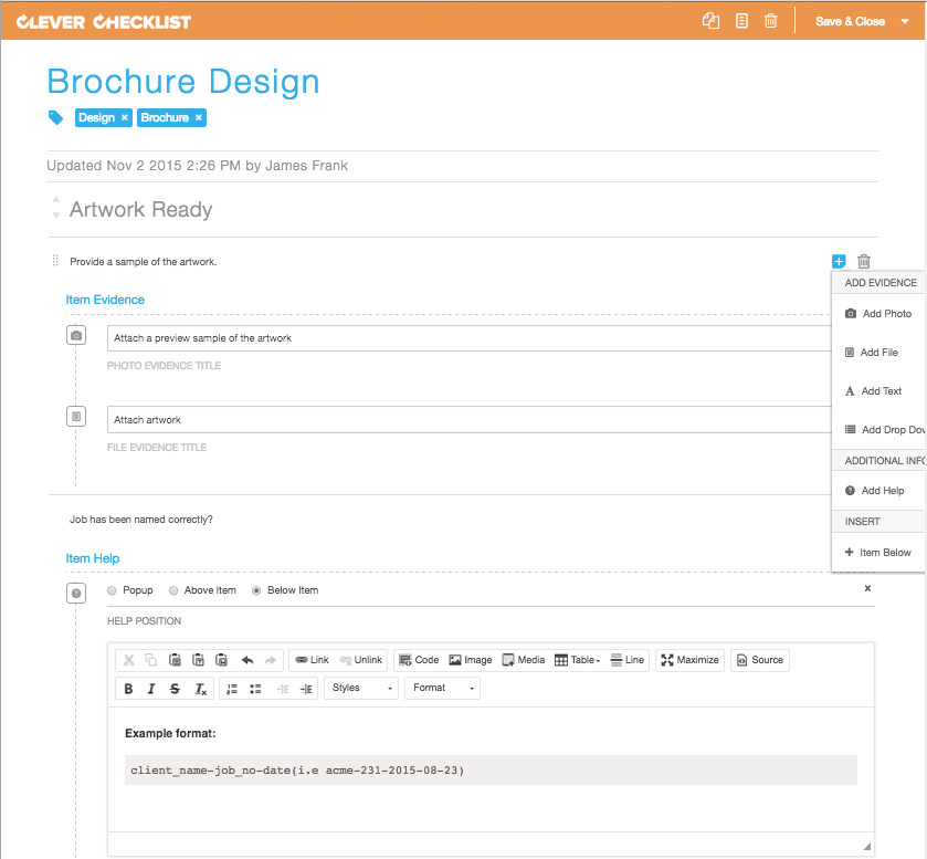
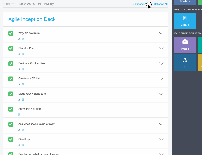
Before:
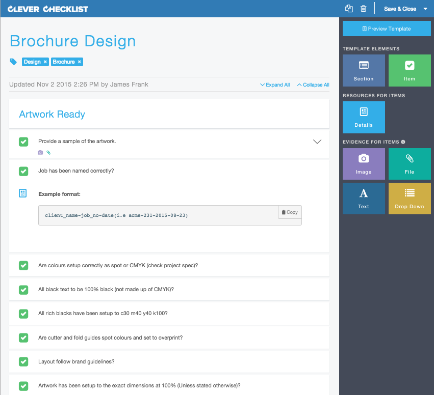
After:
Sidebar
The most prominent new feature when you now open the template editor is the right hand sidebar. Previously we hid all the extra options inside a popup menu at the end of each item row. We found this wasn’t particularly obvious to first time users and it often came as a surprise that these extra features existed!
Now all the blocks you can add to an item are visible in the right panel to be dragged into the work area or clicked on to be added. Elements enable as you add parts to your template to signal when/where things can be used.
The sidebar now also holds the "Preview Template" button to readily review before saving if required.
New Visual Hierarchy
While there is a lot of freedom to make lists how you would like; there is a clear hierarchy that we want to make more obvious and easier to digest. Sections have items, items can have details and evidence. Sounds pretty simple huh?
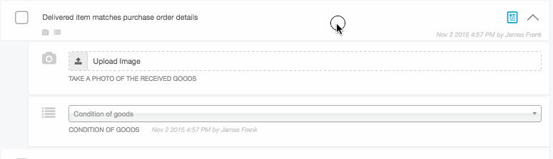
We moved more towards a "what you see is what you get" style approach. We’ve bounded and clearly separated sections and their items to make each element visually distinct. Evidence and details are indented under the Items they belong to, to show ownership.
Collapsible Items
Working on items with multiple evidence and detail options is now easier with collapsable items. Use the chevrons at the end of the row to tuck away any excess information while making your edits.
There is also a new "Expand All / Collapse All" option at the top.
Checklist View
This is where all the work happens and most of people's time is spent. Similarly to the template editor feedback, we understood there was room to improve the visual relationship between elements.
Our goals were to:
- Improve the visual hierarchy.
- Make all the features of checklists more obvious and accessible.
- Improve the sense of accomplishment while working through checklists.
Consistent visual hierarchy
We took the new look from the template editor and moved it into the checklist view. Items are clearly distinct and their evidence requirements are nested underneath. All the dotted lines are gone!
Dues Dates and Sharing in the header
Being able to set due dates on checklists and sharing them to others have been previously only accessible by their icons in the main toolbar. Where practical, we would like there to be 2 ways to do something in the interface. So to facilitate this we’ve incorporated a "Add Due Date" placeholder in the header where the date will show up once you’d set one. We’ve also introduced the sharing icon in the header and offer the ability to open the sharing panel from a new + icon.
Evidence mini icons
As items can now be collapsed, we wanted to give a summarised progress of evidence when an Item is rolled up. Mini icons of the types of evidence added to an item are now visible directly below the item text. These turn green and get ticked off when their requirements are met.
Also: Gravatar Support
We like seeing smiling faces and selfies. User icons in the system before were always in the format of first initial, last initial. Now when available, Gravatars are displayed whenever a user has one uploaded.
Gravatar stands for Globally Recognized Avatar with many popular applications like WordPress having built-in support for them. When a user leaves a comment or uses a site that supports Gravatar, the Gravatar servers display their avatar next to the comment. This allows each commenter to have their identity throughout the world wide web. Gravatars are bound to a user's email address.
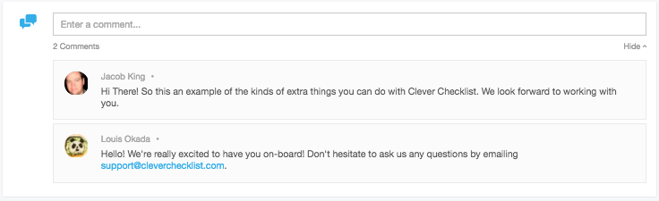
We use the email address that was used to setup the account to display their Gravatar. Create your own Gravatar here.
TL;DR
- New Template Editor look
- New Checklist Doing Mode look
- Gravatar Support
We hope you enjoy the new look and feel and look forward to your feedback!